Life as a parent gets busy. Your focus shifts, your free time changes, and your priorities are no longer yours to decide. The things you want to do get quickly replaced by all the things you have to do on top of the things you had to do already. It's normal and completely fine. It just means that sometimes you're late to the party on things…
Most that know me understand that I have a watch band problem collection. I have a Markdown-formatted table in Drafts that I use to keep this up-to-date for my site. When I've added a band or five, I have to enter in the information, renumber the entire list, and there's a bunch of friction that takes time to manage it. I'm decently proficient in JavaScript, but not enough to have this automatically handled for me.
I've heard the term "vibe coding", and although I hate the term, I get why this is a wonderful thing. What would have taken me hours to do on my own through painstaking learning and research took me about 15 minutes to create using Claude.
I started with a simple prompt to have it write me a JavaScript function to format a Markdown table, renumber the lines, etc. But then I remembered that it can be smarter by telling it that what I really wanted was a Drafts Action script, so that I can just copy and paste it into the step in Drafts, and not have to do any additional work with the variables. I almost exclusively use the Sometype Mono font when using Drafts, so I want it to look visually good in the editor when I see it, as well as be able to use it on my site. I asked to have additional criteria added to make sure it only formatted the Markdown table and nothing else, automatically padded columns correctly, looking at the size of each line to make sure it's the same, and then process the table accordingly.
After a little back and forth to make it perfect, I ended up getting the code to create my Renumber Watch Band Collection action. I know that this is a small thing, but it had been bothering me for months that I had to do this manually. I finally had a half hour to sit with my thoughts and simply tell an assistant "this is what I need from you". I'm a fan of this style of AI that assists me to make my life easier and makes some tasks less tedious.
I'm always in search of both the best and minimal setups I can get. Camera, computer, EDC, you name it. And that is especially true for when I want to have solid charging when I'm traveling. I've had setups previously that did the trick, but over time my needs have changed. The computing hardware got better, became capable of charging faster, and the technology and features of the devices that charge them get upgraded. GaN made a huge splash a couple of years ago, and has only continued to get better. We have cables capable of high data transfers and high-speed charging. And the wall chargers are getting more sophisticated.
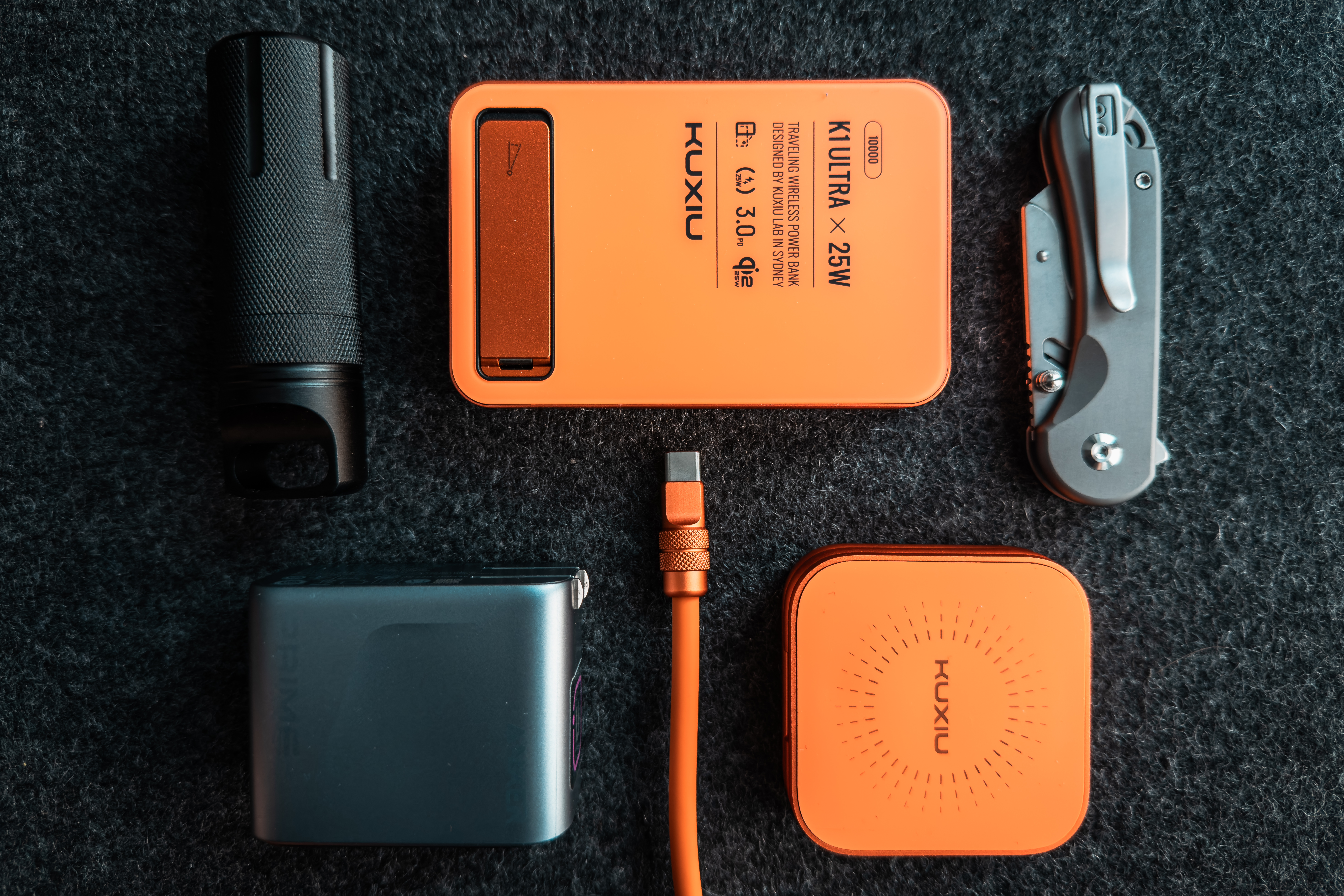
I wasn't originally going to be upgrading my setup, but there were two major events that forced my hand: first, my son needed to upgrade his charging setup, and there was zero chance I was buying him new things; and second, and probably most importantly, there was finally color in the iPhone Pro lineup – Cosmic Orange. When the Ultra was first released, I immediately wanted it for the design and the orange accents/bands. So when I heard that an orange hue might be coming to the Pro, I knew I'd be getting it if that were true. And I couldn't hit buy fast enough. It wasn't long after the announcement that other manufacturers started creating their own Cosmic Orange items to make it all match. The first two companies that I saw to do this were KUXIU and ChubbyCable, which are at the core of my setup. Who knew a color could lead to so much change…
Before I get to the components of the setup, I need to talk about what I charge while I travel so this all makes sense. I'm going to focus on my personal devices and not anything work related, though this charging setup is flexible and robust enough to handle both. For most trips, I take my iPhone 17 Pro, Ultra 3, 11" iPad Pro M4, and AirPods Pro 2. There are other items that I take on a per-trip basis – like a light or gimble – which are all USB-C devices. In fact, I'm completely on USB-C at this point, and I couldn't be happier. At the most, I need 4 USB-C ports to charge devices. I used to have a 5-port charger, but it was too bulky for my bag when I've been trying to use a smaller, more compact 9L sling. When my son needed to charge more things, I looked for a new one. I quickly found the new Anker 160W 3-Port Charger. That's plenty of power for my needs, but only 3 ports.
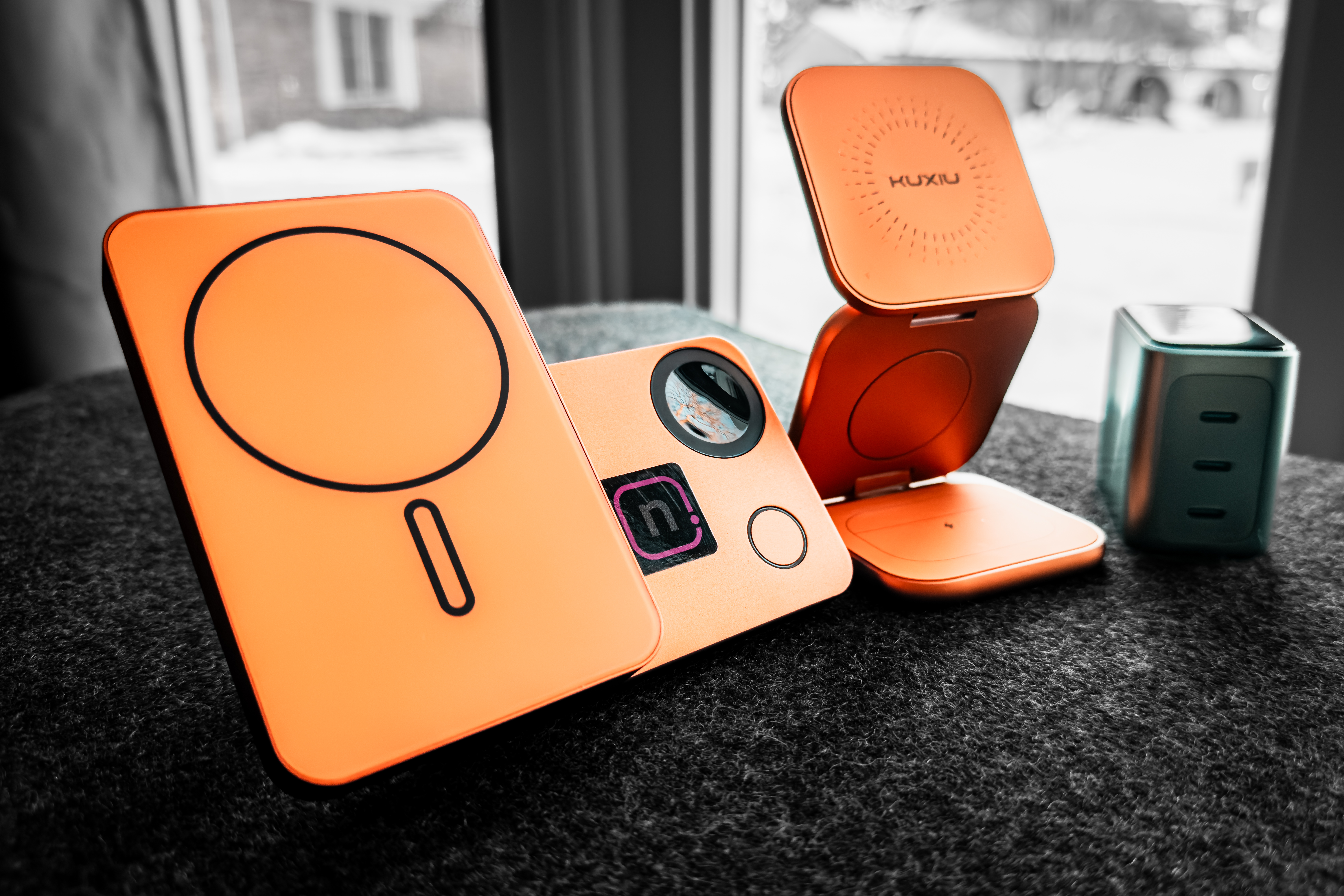
As it turns out, having 3 ports isn't a limitation after all. Implementing a good 3-in-1 charging stand for travel only takes one port. Enter the KUXIU 3-in-1 Charging Stand: this one is Qi2.2 capable, and best of all, comes in Cosmic Orange, a perfect color match to my iPhone Pro; it's extremely sleek, requires a minimal footprint, and folds up compactly. In the second port, I just use a cable to charge my iPad Pro, and the ChubbyCable 2m USB-C Cable – also in Cosmic Orange – offers the fastest data speed and charging rate, while being aesthetically pleasing. My only complaint with the cable is that the connector ends aren't flat enough for me to use this with the 3-in-1 charging stand, so I have to use a normal USB-C cable for it. And for the last port, by using the ChubbyCable Duo-Flex, I can turn that third port into two giving me four USB-C charging points total.
But what about charging while out and about with no wall outlets? I'll need a battery pack. I already have several, but I could not resist another orange item: the KUXIU Foldable Charging Bank. This is advertised as a 3-in-1 battery bank: a MagSafe charger for the phone, a Watch charger, and a USB-C charge port. The other features like a kick stand and a rated capacity of 10,000mAh – large enough to top off my iPad if needed – make this a solid battery bank for me. Depending on the trip, I might carry an additional battery bank, but this is my new go-to carry. I'm usually only charging one device at a time, but it's nice to know I have options.
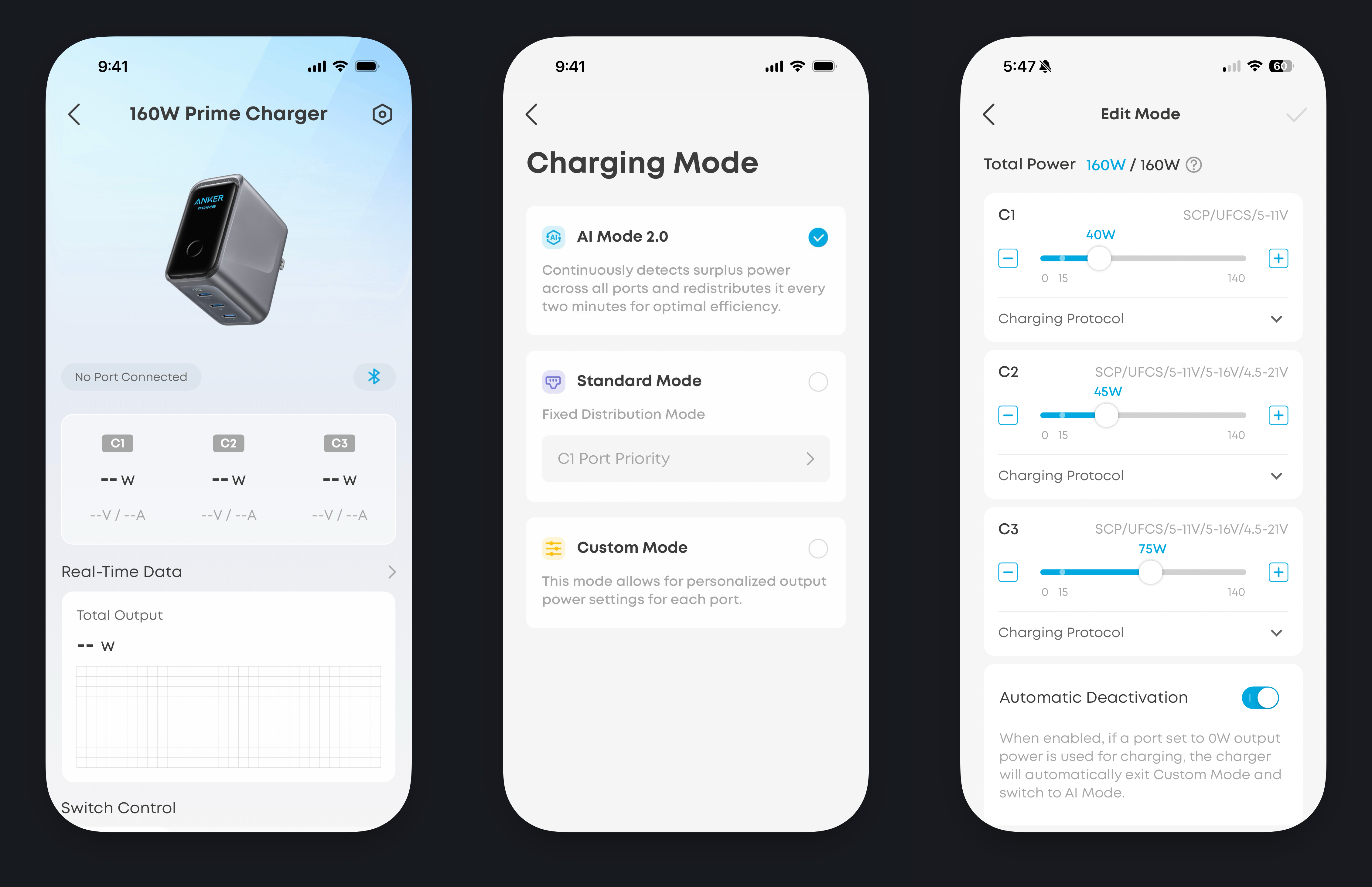
When I ordered the Anker charger, one thing I did not really look at was the connected app, which actually provides quite a bit more features than just a standard charger. Anker, like everyone else, is using some AI-magic to adjust the output of ports according to what you're charging. This is generally what I use, but there are few specific times traveling that I want to make sure I'm getting plenty of power to the 3-in-1 charger. Once the app was connected, I.. updated the firmware. But I was then able to create a 'travel' configuration to change the output of the ports: 45W for my iPad, 40W for my 3-in-1, and 75W for the dual cable. If I'm traveling for work, I can also switch it to a fixed distribution to charge my work laptop at the maximum capability using a single port. Most of the time, I do leave it on the AI setting and forget about it, but it's nice to know I have options. Having this charger made me realize: I can get around fewer ports, but I need the power behind them to be great and customizable to fit my needs. That has been the game changer with this entire setup.
I really feel like I now have the perfect travel charging kit, one that fits my needs and my perosnal aesthetics. This has handled all the trips I've taken in the fall and the holidays, even as I experiment with different situations. I don't feel compelled to keep looking at something better, to constantly tweak and chang it. And based on the devices I use, I'm confident that this will not need to change for a long while.
For all the other gear I use, you can check it out here.
As the new season of WWDC has closed, the time for sharing the beta screenshots is upon us. And while I love to see framed images, my preferred way of sharing is frameless. And there's no better tool for that than FrameShot for iPhones, developed by my friend Keir.[1]
I've used a version of the shortcut before, but Keir has taken it upon himself to add not only my favorite frameless but also framed as well, all in 3 different background choices: light, dark, or transparent. You can download the shortcuts from the link above to try them out.
I'm super pleased with these, and I will likely start using the transparent option almost exclusively for beautiful images of my homescreen.[2]
For a while now, I've had my iPad Pro next to a 27 monitor for my home setup. This is on a dual-monitor VESA Mount using a magnetic mount for the iPad Pro. It's been working out very well for a long while, given that I had the M1 12.9" iPad Pro.
So when the new iPad Pros were announced and I knew that I was going back down to the 11-inch size, I figured it might be a while until I had a magnetic mount again. But I remembered that there were multiple people out there that created their own in the past from a folio case and some wood. I know I'm a bit handy/creative, so I thought I could manage this pretty easily.
Preparing the way.
First, I needed to see if there were any magnetic smart folio cases. As was with my previous Pro, I quickly found the ESR iPad Pro Folio: not only is it just like Apple's – except for the new magnetic rails, which I expect them to create at some point – but it's also around a quarter of the price, with the added benefit of a protective magnetic flap for the Pencil. So I ended up ordering 2 of them, using one normally and one for this mount. I also knew that I needed to fasten the VESA mount plate. I added some M4 threaded inserts and socket head cap screws to my order to make sure I had everything on hand for easy assembly.
No room for error here.
Next, and very delicately with a fresh utility knife blade, I used a ruler to align the cut of the folio case, splitting it in two. ProTip™: if you have a metal ruler, it sticks extremely well to the folio case and doesn't move while cutting. This gives the perfect outline and maximum attachment. I did think about cutting down the folio case back, but ultimately decided it would be more work to do everything cleanly and scrapped that idea.
Then, I found a scrap piece of 1" x 8" pine. You don't have to use pine: you could use plywood or other hardwoods that you might have. I cut it to the length and width of the folio, cutting the width just under the camera opening of the folio case. Once this was cut, I located the VESA mount holes and drilled a pilot hole for the threaded inserts. I sanded the corners and the piece, then routed the back side to give it a more friendly edge, though routing is not a necessity. A quick sanding and black spar paint finished off the wood part of the project.
Leave plenty of dry time for both paint & glue.
With the board painted black, the threaded inserts installed, the back of the folio case super glued, and everything fully dried, all I needed to do was attach the mount plate and put it on the arm. I ended up adding some cable management for the USB-C cable to make it super clean.
I think this is just about the most simplistic build that could be done for this, and what most people would be best served by. I could have done a few things differently to allow for a super-slick hidden cable management system, but in practice it's perfectly fine. I'm sure that there are other material options here instead of using wood based on your own aesthetic - like 3D printing – so use what you think might be best. Fun little project, and it saved me a bunch of time and money waiting on someone to make it for me.