Function by a Thousand 'Cuts
I recently shared my home screen setup in the Club MacStories newsletter. As is tradition with me, I changed it about 3 days after publication. And then again. And again. But rather than just mixing it up, I sat down and totally re-thought the functionality of my home screen, from what I'm using to the placement of the icons & widgets. Whereas I started and ended with a single home screen, the functionality I've gained in this new setup is far greater than I had hoped.
The use of shortcuts has greatly improved the use of my phone, simply because I have more at my fingertips. It's even better on any iPhone – and maybe even a future iPad – with the Dynamic Island, simply because it takes no real estate to show it running. It just fades away into the background. This whole idea for me really was borne from my Action Health shortcut I made because the Ultra has the Action Button. This gave way to ActionCut, which has now morphed into something better. These launcher-style shortcuts have been around for a long time, so this isn't a completely unique idea. But with the improvements to the hardware and software, the time to take advantage of this is now.
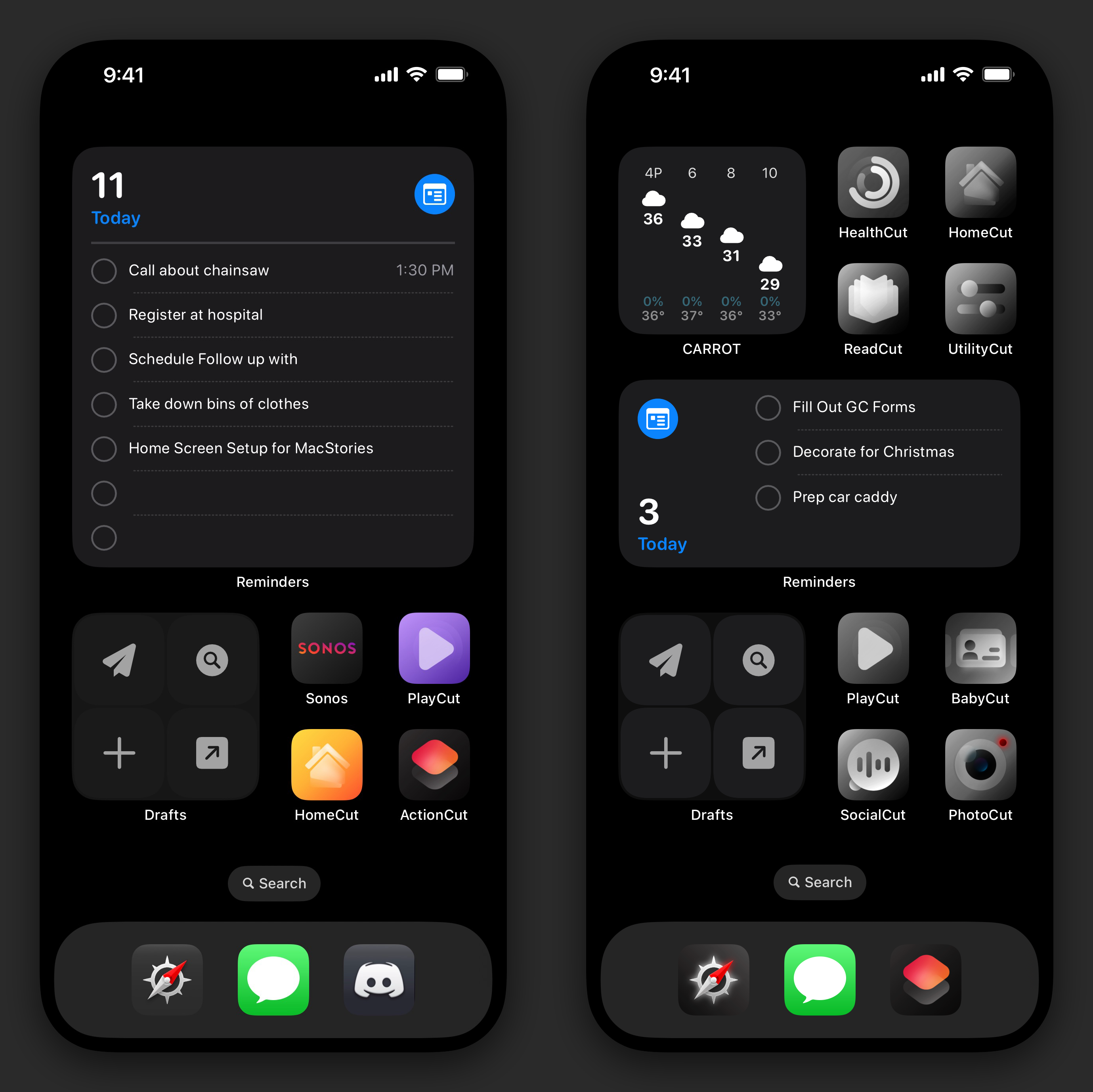
Let's first talk about the layout: what I had originally submitted to Club MacStories was a layout of a large widget at the top, a small widget at the bottom left, a group of four icons at the bottom right, and 3 apps in the dock – like a gentleman. This gave me a lot of information and usability, but I found myself wanting a bit more. I've had hidden home screens for a while to retain different iterations of widgets and widget stacks, so I turned them all on to take a look at what I had. What I started to realize is that some of the information I was looking for – like weather – really would be better for me in a small widget stack rather than taking the large widget, while others like Reminders still needed to have more usable space while remaining somewhat small.
Now my layout is bifurcated by a medium-size widget stack in the middle with a small widget stack on the left and four icons on the right at either the top and the bottom. I'm right-handed, so having the icons on the right rather than the left makes more sense. Having the more productivity-focused bottom left widget stack puts it in the right place for one-handed use. After all, this is meant to be functional for my daily use.
Let's talk widgets for just a brief moment. Since they've been introduced, stacked widgets are what I have been using. Most of the time, I don't allow for suggestions nor do I set it to auto rotate. I think of stacks as multiple layers: I want that top layer to be what I really want to see all the time, but if I need something more, I'll just move to the next layer to see just a bit more. I always start with what I want to do with the stack, then move to which widgets belong there.
My center medium-size widget stack is Reminders, followed by Calendar, Carrot Weather, and then Lumy. I wanted to have Reminders not take up the entirety of the large widget size, but also have it be readable across. The small widget is just too small for most of the lists. And I even found that with the large widget, you had to tap all the way at the top of the widget to enter into Reminders; I would often tap the middle of the widget instinctively like I had done before widgets became interactive in iOS 17, and would accidentally mark tasks as complete. That's the main purpose of that center widget, but it's nice to flick to my Calendar, the weather, or the golden hour times in Lumy.
My upper small-size widget stack is all Carrot Weather. Why do I have it in 2 places? That has to do with reachability, honestly. First off, the small widget stack auto rotates. So while the default is the current conditions with other information, sometimes it will show me the next several hours during the day; generally at night, it might show me the next few days as it thinks I want to peer into the future. But I also have Carrot Weather in the center stack because I sometimes want to get there quickly and my thumb can easily reach there.
The bottom small-size widget stack is more about my productivity with Drafts and Shortcuts. Any of the actions and shortcuts in these widgets are more about launching to the right spot for me to get things done. Do I need to start something new? I can do that quickly. Do I need to look at my meal plan or grocery list? I can do that too. What about my comprehensive Dashboard note and personal wiki? I can jump into that as well. Access to everything at my fingertips.
Going all the way back to the original ActionCut, I had started this idea that everything was a [name]Cut. It made it easier to compartmentalize things in my brain. When I realize that bringing ActionCut to the iPhone would help me do more, I had it on my home screen while keeping SocialCut in the dock for all of my social apps. But this started to really not make sense once I entered my sleep focus. I wouldn't have access to important things like entering a note or something to my task manager when I needed to do so quickly, so something needed to change. ActionCut needed to move to my dock. So I moved that there first. Then I morphed what was in ActionCut: this no longer had individual actions, but rather launched all of the other 'Cuts that I had made in addition to the quick capture note or reminder actions.
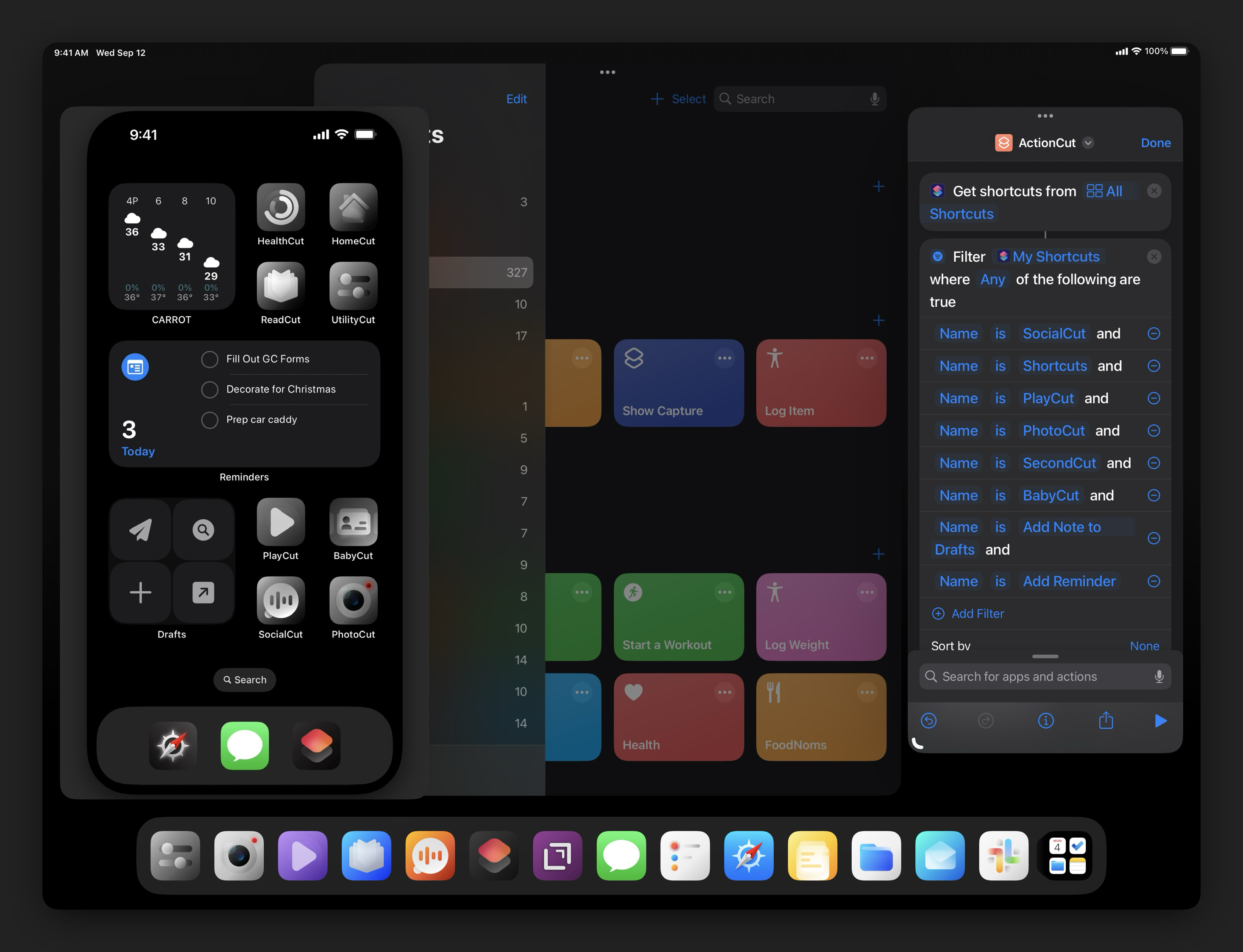
One of the more difficult parts of all this was having an aesthetic that worked well with the widgets and choosing the right icon for each 'Cut. I've used icons from the echoes icon pack before, but I really appreciate the design of these and feel that I can make them work better than having regular app icons or other icon sets. Some of these have been heavily modified by using Pixelmator to change colors and tweak backgrounds. This adds to the customization for me and makes this even more unique. And I did have unique colors for a bit, but I like the overall feel of the monochromatic theme here. Keeps me focused.
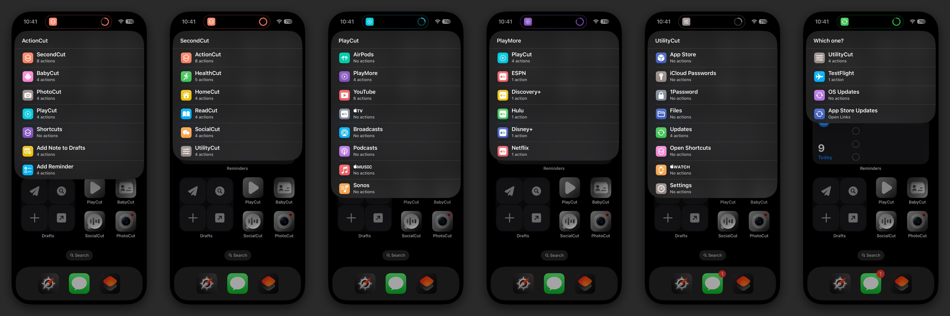
Most of my 'Cuts are a launcher of launchers, meaning the actions within are a menu of single-action shortcuts. I do it this way because I find the visual menu aspect of shortcuts to be better for my brain. You could just make a menu with actions inside, and use emoji to differentiate. There's not really a wrong way to do this. One thing to note is that structuring the shortcuts in the manner in which I have does mean you have to order the shortcuts within the Shortcuts app to have them show up in the order you want. There is a workaround for this that I have discovered, however: if you get shortcuts, apply a filter, and save it in the order you want it from top to bottom in a variable, then it will show up exactly how you want it to when presented with a list. As I have developed more of these, I realize having everything in one list was too big in some cases, and I created additional shortcuts like SecondCut, PlayMore, and updates as a submenus to hide some of the less-used 'Cuts. Using the workaround method I just described, I am able to add the main shortcut back into the submenu so that I can jump back and forth if needed.[1]
So let's talk about the 'Cuts I have. There are a few of the main shortcuts that have extra bits in them for different functions, so I'll just list out everything below, from top to bottom on my home screen.
HealthCut takes different aspects of my ActionHealth shortcut, namely Start a Workout, Log Weight, Log Caffeine, and Log Water; I added actions for opening the Health app and FoodNoms for food tracking. HomeCut is all about things that happen at the home front: Home, Parcel, Ring, and MyQ (for the garage door) are here along with two scenes for nighttime settings for various switches around the house. ReadCut focuses around anything read or spoken, save podcasts; Mail, Books, Audible, Notes, Reeder, and News are all here. UtilityCut is really about settings, files, and updates for the devices; I can quickly open passwords either in iCloud Passwords or 1Password, open the App Store, open to Updates (OS-level, AppStore, TestFlight), open Files or Shortcuts, or open the Settings or Watch apps.
PlayCut is all about entertainment: YouTube, Apple TV, Broadcasts, Podcasts, Music, and Sonos are where I do most of my entertainment; I also have a quick action to connect my AirPods Pro to my devices, as that is faster and more reliable than swiping down from control center and tapping through to get them connected. A new addition is the PlayMore shortcut, which is effectively a second menu of choices for less-frequently used entertainment apps. SocialCut just gives me access to the apps that I use to communicate – which is changing as of late because certain aspects of social media are really infuriating and not worth my time or attention. PhotoCut is a mix of camera apps, photo/video editing apps, and some additional photo extensions from shortcuts that I use with frequency. And BabyCut is all about my daughter and tracking things like diaper changes, feedings, and sleep.
This brings me back to ActionCut: I've completely changed the original concept of what it was. It's actually the icon that I tap on the most because it's in the right spot for me. And having the ability to put whatever I need to by calling any action or any launcher is hyper convenient for me. It's my iPhone 14 Pro's version of an action button. I've even made one for my lock screen that calls different items I might need from there too. Again, most of these are a launcher of actions. But with the notification running at the top and out of my way, this feels more fluid on the iPhone. I can make my home screen more aesthetically pleasing and functional for my everyday use. If I add an app to my repertoire, I can simply add it to a Shortcut without having to change my home screen. I can have access to a thousand different actions if I want, and have this be the most functional, single home screen for me ever. Time to just enjoy this for a while…
I wanted to say a special thanks to Keir for his support in creating the Frameless Screenshot actions, especially for the iPad Pros. He does great work. You can find him over on Threads @keir, Mastodon.Design/@keir, or his website. Thanks again Keir!!!
This is not unlike a personal wiki in many apps, like Drafts for example. ↩︎