Rethinking Reminders
One of Apple’s fundamental strengths is creating software for the masses. You may scoff at this remark, but it’s true. Look at the ubiquity of Messages, Mail, and Notes: there are other apps out there for power users, apps that offer greater functionality, and apps that have better design elements in place.
And while there could be improvements to a lot of what Apple creates in their software, they have been getting better at creating apps that most users will want to use. If we take the example of Notes, we can see the potential Apple has for creating great software for most users. With the added features in iOS 10 and 11, Notes has become a powerhouse app while maintaining the usability for everyone. Over time, Music and Podcasts have gotten better.1 Mail isn’t great, but that might be more a function of email and email providers rather than Mail itself. But one of the most useful apps on iOS is in dire need of a refresh, a reimagining, and a glorious rebirth.
Reminders.
Task Management for All
It’s no secret that I love task management and task management software. And given that I’ve tried a bunch of software, I’d like to think that I have some perspective on the subject. I think a lot of people’s lives can be improved by task management. For years, I’ve tried to get family and friends to see the benefits; sometimes they do, most times they don’t. But that doesn’t stop me from trying.
What I have often found is that the idea of downloading a separate app bothers people. Sure, they’ll have a few dozen free apps - camera and photo editing apps, several social media apps, a bunch of couponing apps - but heaven forbid they get a paid productivity app involved in the mix. The mental friction of having a separate app to manage their lives can be difficult to get over. This is usually the point where I suggest simply using Reminders: it’s basic enough to get the job done, it’s a part of the OS, and they don’t have to pay to try it out. But the app isn’t where it needs to be.
Apple could take Reminders forward as a key app in the ecosystem if they wanted to do it. And it’s not too far off now that iOS 11 has been released. Reminders can improve in a lot of ways to support further use of the app without taking away from its simplicity. It can be made into more of a task management system with some small changes to the layout and features, all while keeping it simple and easy to use. Sure, there might be some better options out there like OmniFocus, Things for iPhone/iPad, 2Do, or Todoist; but each of those options are for different levels and styles of task management, and can be difficult to onboard with someone who has never used a complex app before.
What I can envision for Reminders is a blending of the some commonly used features for these apps, and doing what they do best — create a version that, while not first, is nearly equal to alternatives and is natively a part of the OS. And it can do all this while maintaining one of its own strengths: being native. There are some simple features that could be added without much of a problem, while others might take some re-thinking and redesign in the future.
New Layout and Aesthetic
There are many changes I would like to visually see, as well as adding some new features. Doing so would not only help this app excel, but also by extension help the user better understand his/her tasks and aid in a true task management system. First things first: take the linen paper background and burn recycle all of it.2 In the UI refresh of iOS 11 and the move to the Editorial-style layouts, I am surprised to see Reminders be left behind. It’s dated, serves no purpose, and really limits the possibilities of the interface going forward. If we look at something more modern, say Files or Mail, there are many positive things that Reminders could borrow from its native counterparts: the dedicated side bar and its behavior, sort states that could be modified to fit the task management paradigm, and there is enough space to have clarity and utilize the space to push an updated UI that works for lists and tasks.
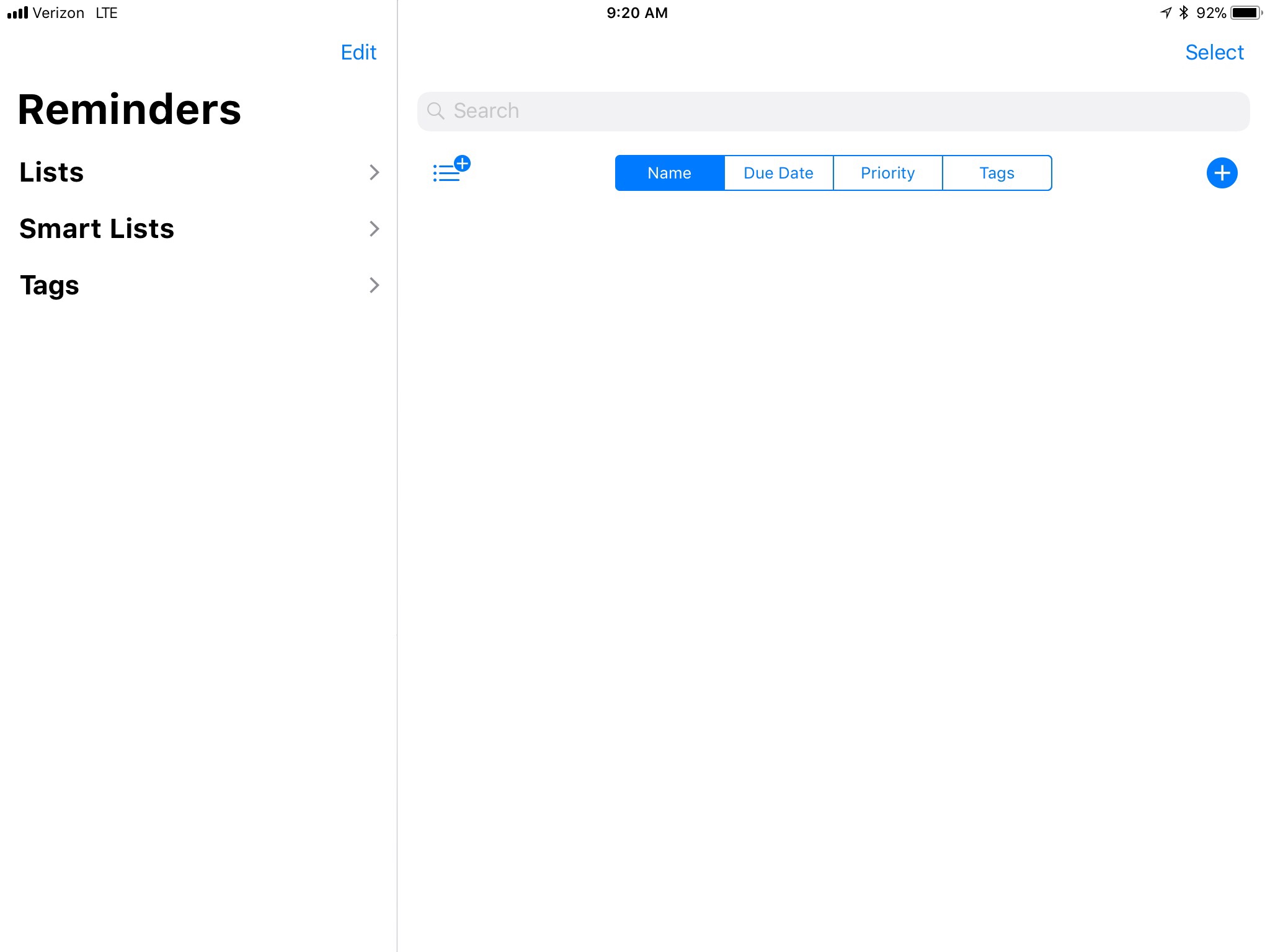
Now that we have a better canvas to work with, the view into your task management can be changed. For the most part, keeping lists separate can still work; in fact, for non-power users, this is likely a preferred method of seeing tasks; in a compact view or slide over, it would present in the same way. For power users like myself, I often want to see all of my tasks at once. Sure, you can keep a separate list of your tasks in another app like Drafts or Notes and move them over when you need them; but using a system like this (as I’m currently doing) is a bandaid. It would be nice to keep all of this information in one place.
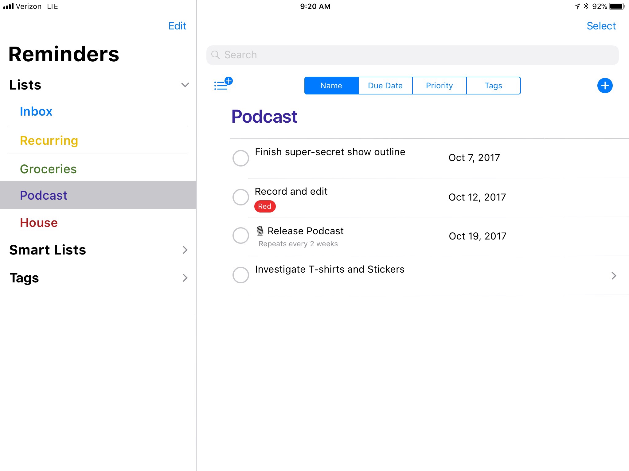
I think Apple can accomplish this by utilizing system lists, like that of the Scheduled list. It could be in its own section of the app, similar to how Favorites is contained in Files. By adding an All Tasks list, the user can see all of their tasks presented to them. There would be headings for each list, denoted by their color, which separate the tasks; additionally, these can be foldable headings to minimize what is in view. This would also enable drag/drop within the full task view between lists without having to leave the current view. In the future, allowing for the addition of user-generated Smart Lists would be a huge benefit to those with many tasks. There could also be a completed and recently deleted task item for the times you make a mistake so you can recover your work, or if you really want to see what you have completed along the way.
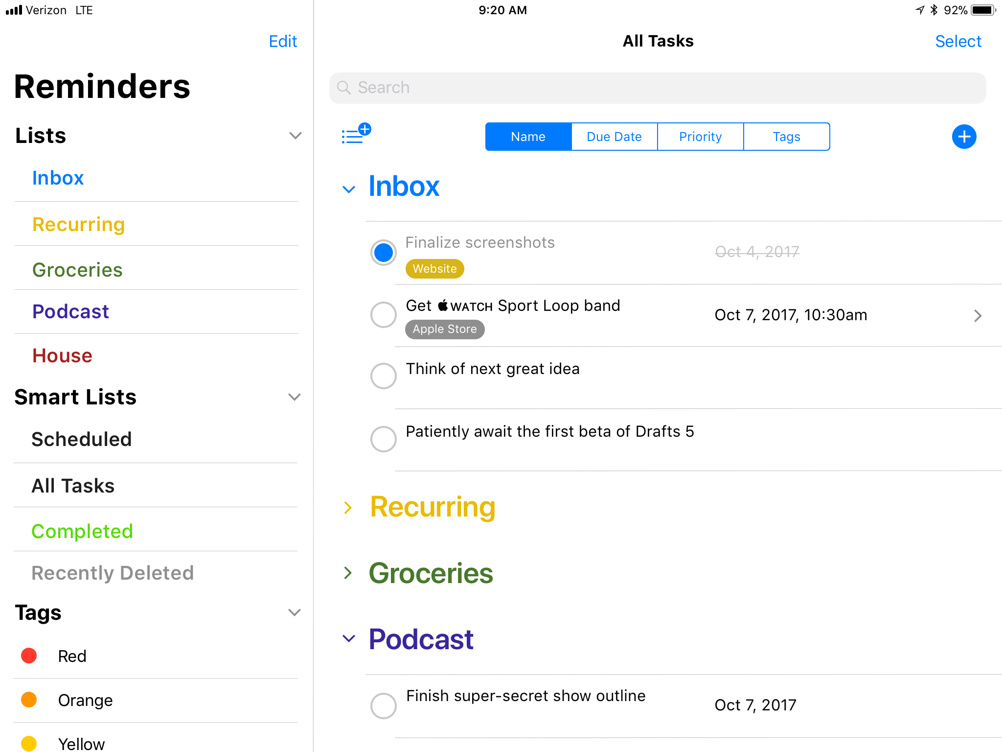
By providing a more modern design, Reminders can have the simplicity it has today while expanding its capability. The utilization of space and information density can be increased with the new UI, while still maintaining the most basic task management. Some of the existing interface for lists can be carried over, namely the color and sharing interface. The task editing can remain the same, but can be presented in an iOS 11 style. It no longer would make Reminders the bastard child on iOS, but would make it part of the new iOS family.
By giving the user an opportunity to view their entire task management structure, it will allow a more-than-casual task management aficionado to really power through a review of what is going on with their entire life, all while using a native solution on iOS that integrates with the entire system.
Tags
Another power-user feature that could be added in an elegant way would be the use of tags. This is already present in Files, and I think presenting consistency across apps would be a huge win for everyone. The tags would be listed off to the side with their color/name; in a single view, these could be shown like a traditional list.
The advantage of having these items laid out in this way is that it also gives a view (or a perspective) based on a tag when selected. If you could have a person or a place as a tag, this could be useful for when you see someone or near a place; it could further be expanded by allowing a tag to have a contact or address applied, ideally using drag and drop. Having the ability to filter your tasks on a tag brings a power-like feature to casual users. Additionally, searching in spotlight for a specific tag would also present items in Files, Reminders, and — if it were added — Notes. The user would only have to remember the name of the tag to find what he/she needed across the system.
When in a view with a sidebar, a user could drag a task over to a tag and apply it, just as in Files. The frameworks for creating these options are already there: they just need to be applied to Reminders.
Drag and Drop
Speaking of drag and drop, I would love to be able to drag anything over to be reminded of it. Think of the “Hey Siri, remind me of this” feature, but without using the voice. I can do this already with a link from Safari or an email. But what about a specific Note? Dragging over a specific note currently copies the entire text contents of the note, rather than a link back to the note itself; I can, however, ask Siri to remind me of this note later, and a link to the specific note is inserted. The difference in behaviors is maddening. Unifying them, or at the very least presenting a user with the option to import a link to the note or the text using a contextual menu, is better for the user in every way.
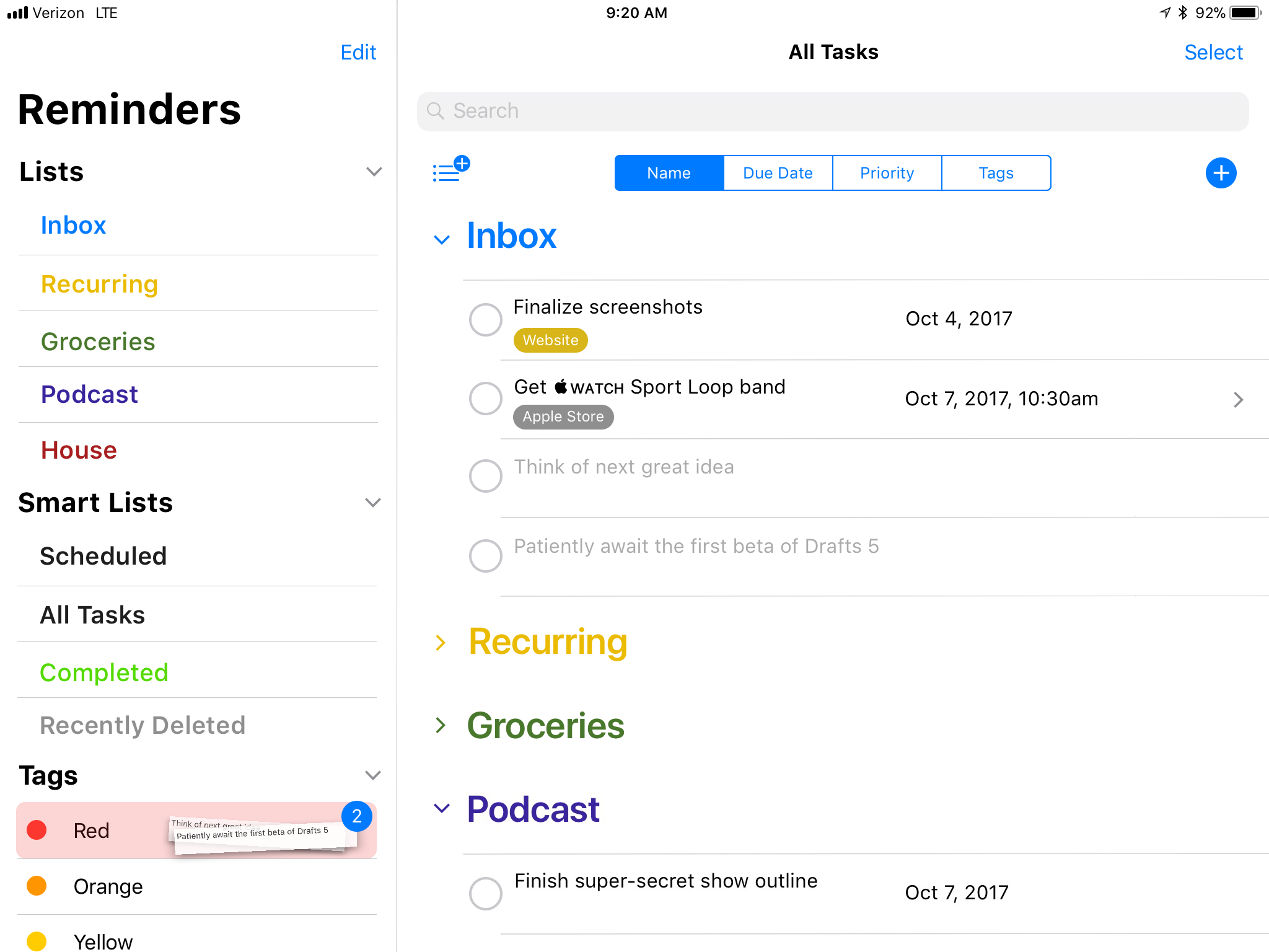
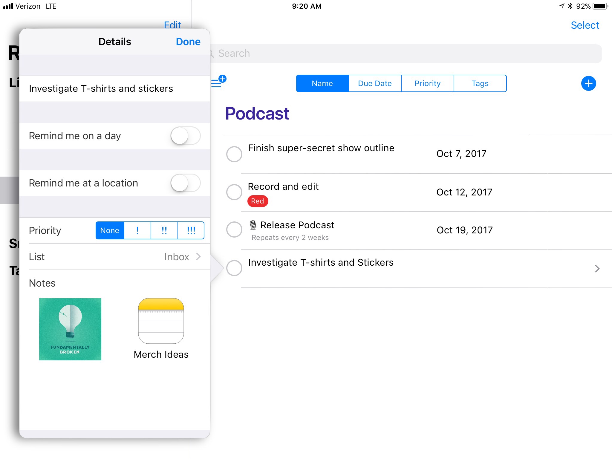
Additionally, drag and drop could bring some other features into Reminders. The ability to add documents, images, etc. to any task is now possible thanks to drag and drop. Having the option to add additional contextual information to a task would be immensely helpful. Need to get a grocery store item, but want to make sure you get the right thing? Now you can take a picture, and drag it right onto the task; the image would be added into the notes section of the task. Want to be reminded to take action on a specific file? Simply drag it from Files, and a rich link to the file would be created. You can tie the important information into a task from multiple sources across the system.
Other Features
Sorting is badly needed in Reminders. The UI elements are there today in Files, and they could be presented in Reminders in the same fashion. Having the ability to sort lists based on due dates, priority, tags, and name are basic functions that any good task manager should provide. If they are provided in other Apple apps, why not this one?

The repeat features of Reminders have been greatly improved over the years, but there’s room for improvement. Most 3rd-party applications have options for repeat after completion, weekday/weekends, and other custom repeats. Going forward, having a pause option for repeating tasks3 would be a fantastic feature to implement; it is a great feature for the user going on vacation.
One of the biggest benefits to making these changes in Reminders is the additional benefits of a native solution. This will play well with Siri, the Siri watch face, and all of Apple’s 1st-party apps. I don’t have to figure out how to mispronounce the name of the app I’m using, I can just speak what I need to do. It can utilize all of the newest frameworks and APIs that Apple releases. It also means that some of the existing features, like list sharing, and can be applied to tasks as well. How great would it be to have native, 1st-party collaboration for task management right out of the box in iOS?
I could go deeper into this, but I’m leaving a lot open for Apple to figure out. The mockups that I have created — all using Pixelmator on iOS — are just a start of what could be; I would love to see some small UI differentiation while still maintaining the overall aesthetic that is found throughout iOS. Maybe they have a better solution in mind, but I hope that they take some key elements from amazing tasks management apps out there, while simultaneously combining it into their own solution that works across the operating system. It needs a functional and visual overhaul, and with the new Editorial UI that has been put into the system, now is the time to make that change.
Presenting new users with a deep-linking paradigm in a non-complex manner will help them better understand what is possible with their operating system and allow them to explore new options. Giving users the options to view their tasks in multiple ways by making things extensible using existing system-level interactions is the best way forward for Reminders. If it is built into the system from the start, there’s a better chance that users will utilize its functionality to enhance their lives, which is something that Apple as a whole strives to do with their products.
It’s time to rethink Reminders and give it the update it so desperately needs and deserves.
