Drafts 28
In the past few years, after a summer of running and testing beta software, I often find it difficult to sit down and think about what is new. Don't get me wrong: it's not because there isn't anything, but rather that it's become second nature to the way I'm working with my systems. This is probably why I don't do massive reviews of iOS, iPadOS, watchOS, or macOS every year: having to keep all this straight in my brain – given everything else I have going on in my life – just isn't going to happen. But every fall, I do enjoy writing about the latest version of Drafts and how it's improving my daily life.
You're going to notice something here: this isn't going to be a big, extensive review: there's no actions, no crazy automations. This isn't for a lack of updates, but it's rather a reflection of where my life is at the moment. I actually think that if I'm going to continue to share content – especially with Drafts, Shortcuts, productivity, journaling, etc. – I need to approach everything I do from this point on from a smaller perspective, rather than an all-encompassing viewpoint. I think that many of you would appreciate shorter, easier-to-digest posts that can give targeted use cases/actions/automations going forward. This is the way.
Drafts, of course, provides the compatibility you've come to expect with the new iOS, iPadOS, watchOS, and macOS updates that occur every fall. This year is no different, but one important thing is that some of what Drafts now provides is further extension of already existing functionality. Some of the new features have existed on one part of the platform and not the other due to OS limitations, but now they are synchronized in iOS/iPadOS 15 and macOS Monterey. It brings a sense of cohesiveness across your devices that previously wasn't there, and I think will open the doors to a lot more possibilities for both iOS/iPadOS and macOS users alike.
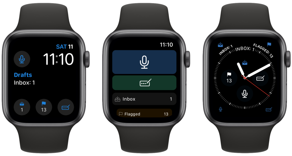
For example, one of the biggest parts of this year's fall update is the all-new watchOS app, completely rewritten in Swift. This isn't a small undertaking, but it takes the already fantastic watch app and adds additional functionality. It retains everything that it had before, but adds the ability for multiple compilation types. If you really want, you can now have an all-Drafts watch face. Another nice feature, and one I've wanted for a while, is the inbox count reflecting the default workspace options; this means I no longer need to see 60+ drafts in my inbox, but rather only a handful that I want to keep in an inbox.

Another huge update is the incorporation of Shortcuts for the Mac. As I don't use a Mac, I'm not the expert here, but you can use a lot with it. All of the same features you've come to love on iOS are available – even if Shortcuts is buggy – and the Mac adds a few specific items like AppleScript and shell scripts. Hopefully someone out there writes this up nicely: should they do, I will link it here.
While I do use the watch and not the Mac, those aren't the big things for me this year, despite the massive efforts of the AgileTortoise himself to bring both of them forward. He's not only been working hard on those, but many others across the other parts of the ecosystem. One of the big features in iOS/iPadOS is the implementation of Live Text. This feature is great, as you can select text from images and scanned documents. Drafts takes advantage of this feature in iOS by providing a menu option to scan a document directly and import the text right on the iPhone. This, like dictation before it, has been a game changer for me when I've needed it for work, personal, or legal things over the course of the beta. The fact that I don't have to manually transfer something into Drafts is huge: from a small bit of text I want to use later to a large document, I can tap (from the widget!) and import the text right into my text editor of choice.
In iPadOS, the support for the latest implementation of the keyboard shortcut menu overlay is there, which mirrors the awesome Global keyboard shortcuts introduced this year. You already had something similar in previous releases when you pressed the command ⌘ key, but it was a jumbled mess of what the keyboard shortcuts where. Now, you get a tabulated overlay in easy-to-locate divisions. Given that I have a ton of actions and tried to set up the best keyboard combinations that I could, this is very helpful for me since I might forget them if they are infrequently used. There are 4 categories that are default – file, edit, editor, and view: the remaining sections are all of the actions which have your keyboard shortcuts assigned. Once you invoke the menu, you can either enter the keyboard combination or, my personal favorite, tap the keyboard shortcut in the menu overlay to run it. Saves me some clicks, and I love it. There's also a search feature where you can search the menu overlay, which is nice for someone like me who has a lot of actions to search.

The share extension has been updated to include the recently used drafts for easy selection and re-use. While this isn't the Quick Note feature we'd all love,[1] it is going to be helpful for when I'm writing/researching a topic I want to investigate and/or write about. Another fantastic usability improvement is the new tag selection interface, which lets you select from your current tags as you type so you don't duplicate them in weird ways (think: post, posts). In the last few years, I've actually pared down my usage of tags because I didn't want them to proliferate too much; now that this feature is there, I might tag my drafts with more than a singular tag. I like this interface so much that I'm hoping Drafts adds this same functionality for creating [[wiki-style]] links, as it's something I'm using a lot more for my own personal uses. I know that this would be a massive undertaking like folding headers would be, but I can't help but want both in the future.
Speaking of wiki-style linking, there are a few new ways to interact with them. You can now right-click/long tap on them to give a quick look of the text as well and commands for wiki links: open the draft in the current or new window, preview in a new window, or a series of copy commands for the content, title, link, or UUID. I really like the new expandable/collapsible menus in iOS/iPadOS 15, which Drafts takes advantage of here; it's a great way for Drafts and other apps to add a lot of functionality at your fingertips.
Folder bookmarks are a feature that have been included in apps like Scriptable for a long time. But they are now included in the File action and File Manager scripting. This will allow those that like to write in other apps – say Obsidian or iA Writer – to save to a specific location outside of the Drafts sandbox. You can also use the scripting to read as well as write to a location, making it possible to use Drafts with apps like Working Copy on iOS/iPadOS or Taskpaper on the Mac.[2] I think this will open a door to those that love using Drafts on iOS/iPadOS and then might want other tools on the Mac. It's not using the file manager to store the files, but it does give the option to use it through actions. I can see where someone might use this to run a single action on files with a specific tag, and have them saved to a specific location in Files; they might also run another action to import those files back into Drafts. It's not something built in and requires manual syncing but it's very possible to create now. I hope to see it taken that last step further to open up Drafts to more people who are searching for their ideal solution.
There's a new "What's New" screen where you can find all of the high-level features as well as a link to the full change log to see the small improvements to things like interface updates, automations, bug fixes, share extensions, and more. You can find this in the Settings (gear) menu in the bottom right of the screen, just under where you can manage your subscription.[3] You can interact with this new what's new screen and even jump to the Drafts website to check out specific features or the full change log. And I almost forgot the best part of this update by far: the two new icon choices. I really adore the color palette of both of them and think they are fantastic additions.
The biggest thing that strikes me with this release is the continued customization and usability enhancements update after update with Drafts. Going all the way back to the initial Drafts 5 launch, the customization was further refined from Drafts 4; workspaces created a customizable, modular interface to make that app yours. In Drafts 15, contextual menus and updated icons further extended the customization to pick just the right look for workspaces and actions; Multiwindow support brought more power to the user by navigating back and forth through their drafts. Drafts 22 brought us widgets to customize our home screens and quickly jump into the app or use an action directly. In Drafts 26, the ability to completely customize the interface and create your own syntaxes was introduced, spawning completely unique apps from user to user. And now with Drafts 28, we get more integrations in actions to make Drafts yours and be more extensible. This is yet another solid release in a long string of updates since April 2018. I'm looking forward to what's coming next.
