ActionCut

A short while ago, I created a new shortcut called Action Health to use with the Action Button on the Apple Watch Ultra. I submitted it to MacStories as part of Automation April, purely to share what had been created and hoped that others might find it useful. To my surprise, I won the Best Health Shortcut this year, something I didn't expect at all.
Truth be told: I actually had forgotten that I had entered it into the contest, as I've been using a different shortcut after putting Action Health into practice. I was finding that I wanted to have access not only to start a workout or log something, but I also several other task-oriented and messaging options at my fingertips. So it made sense to fork the shortcut from the original.
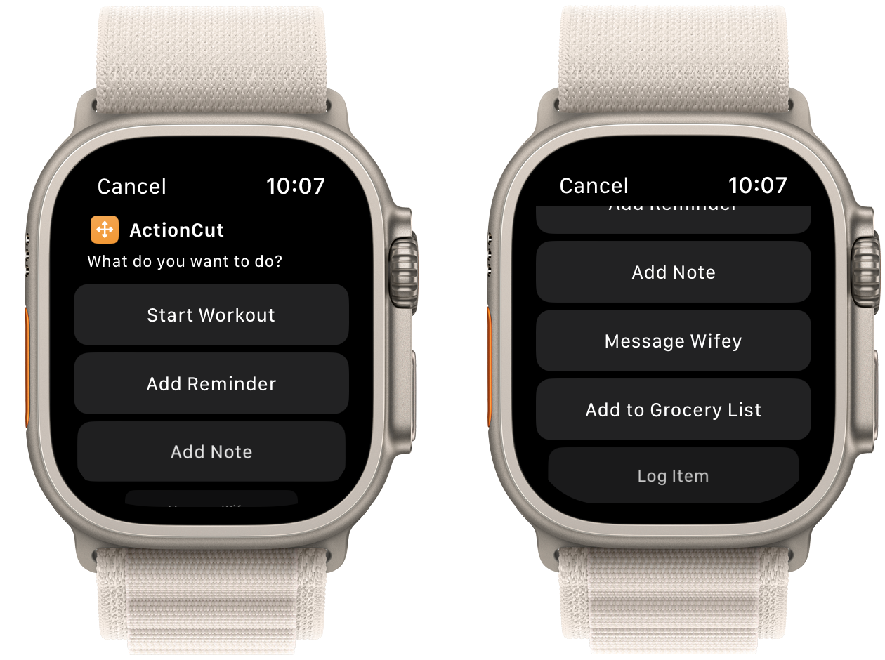
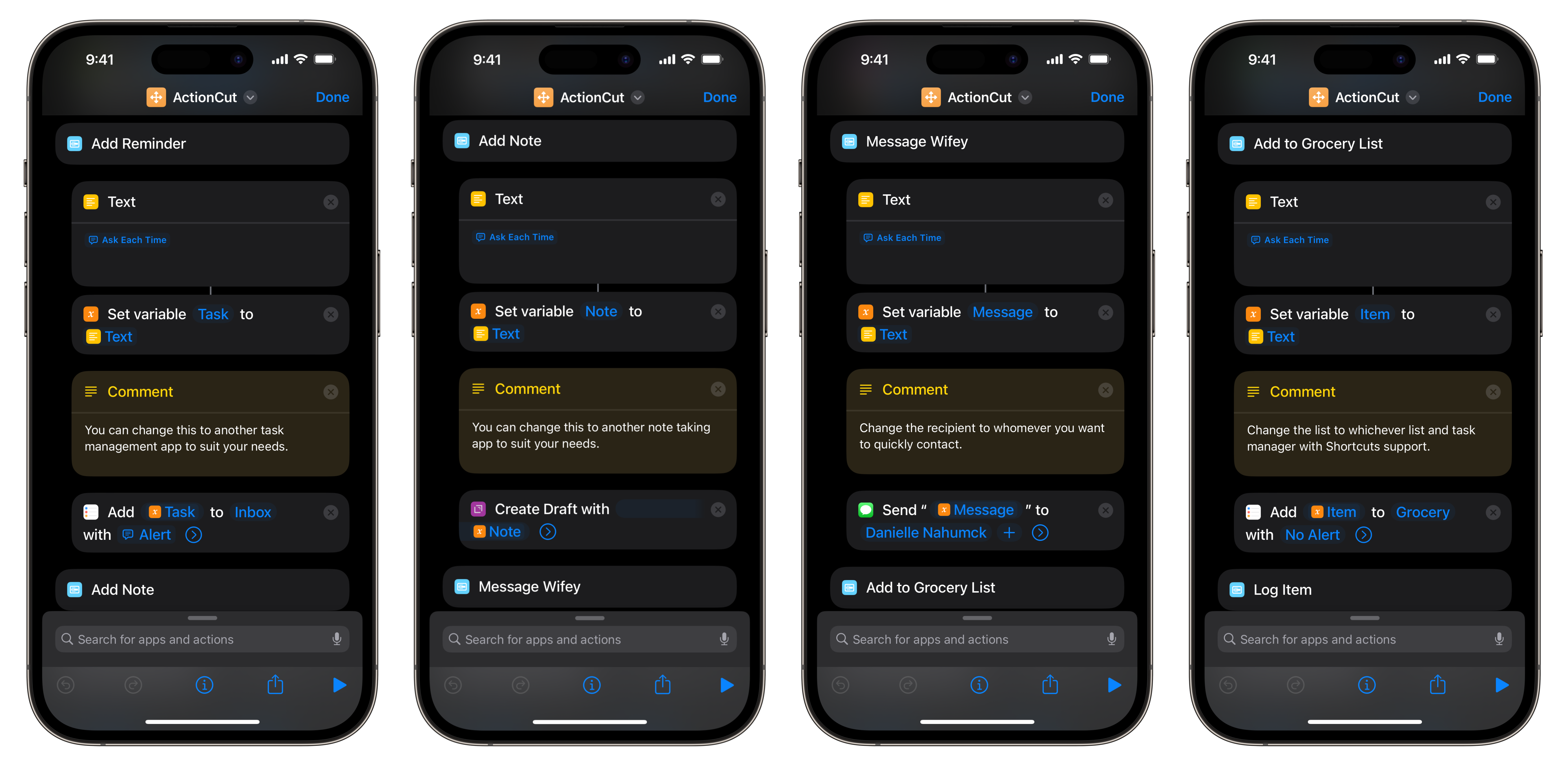
Ultimately, I created ActionCut. This takes all the good from Action Health and adds the additional features that I find myself wanting to do quickly from my wrist: create a task in Reminders, create a note in Drafts, send a quick message to my wife, or add something to our grocery list. The idea here was that it needed to be a simple tap of the button and fast entry so that I can capture quickly and move on. I also took the logging actions from Action Health and moved it into a single menu item; I don't do these as often, so tucking them into a submenu was better. For the task and note entry, I made this shortcut to use the apps I prefer: Drafts and Reminders. But you could also modify this to include other task management and note taking apps too as long as it has Shortcuts support. For each added component, I've made it so that you have to enter text via the keyboard, but you can also then quickly tap the microphone to start dictation. You could modify this to be dictation only, but there are times where doing so is inconvenient.

Now, I know what you're thinking: why not just use complications for this? And the answer here is simple: I might not always have a complication available. Just like the iPhone dock or home screen, real estate on the Watch is a premium. Sometimes I need a travel watch face with other complications, or I need a fancy watch face for a special event. And the Action Button provides me with – much like the back tap on the iPhone – a way to quickly access these little programs to do more with my watch. And as I think of more options, I can add them to ActionCut going forward, so it's very expandable. I have found that by implementing ActionCut, I'm trying new watch faces just like I tried out new home screens on the iPhone when widgets came and I removed Drafts from my dock, all thanks to this shortcut freeing up space and being tied to a button. The addition of widgets was a huge foundational shift for me on the iPhone, and I'm starting to feel that with the Action Button on my Ultra when using ActionCut.
