A Little Note on Notes
As I was preparing to receive my Apple Watch,1 I started gathering different information that I wanted to refer to when setting it up. I used Notes.app to make saving links a breeze, and I like the way they are saved because they are visually appealing.
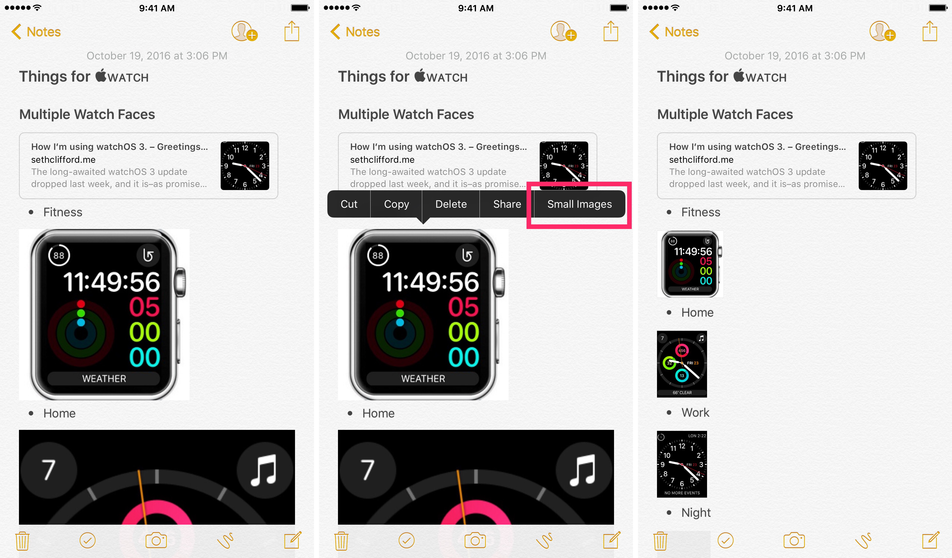
I also encountered several watch face layouts along the way that I wanted to keep in mind when setting it up. When I started adding the images, they weren't visually in the right spot; I wanted to have them indented to the right. Turns Out™, that's not possible in Notes.app.2 But I ended up stumbling on a feature of Notes.app that I didn't even know existed. Here is the view of the note that I was compiling:

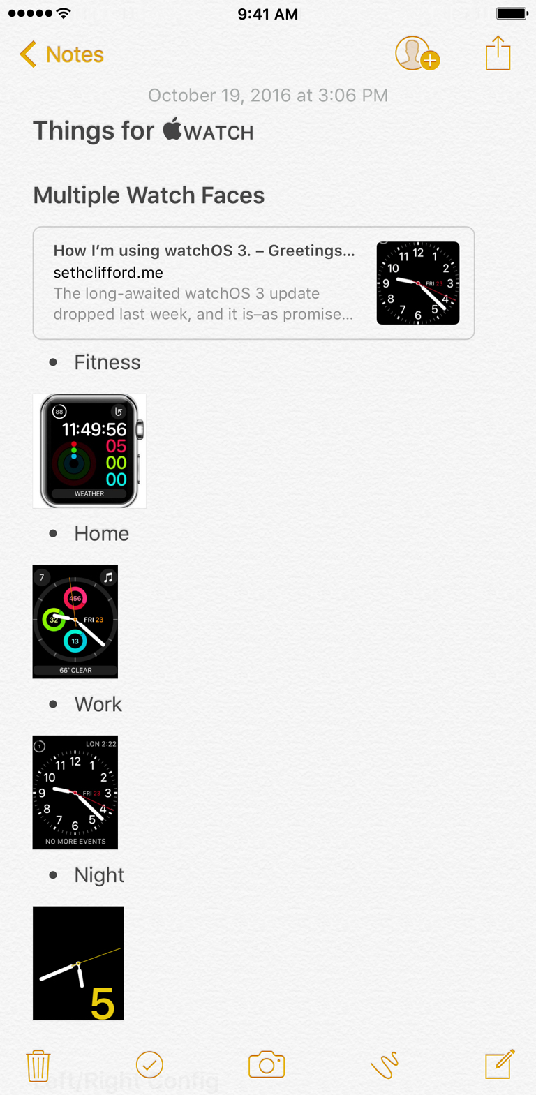
It's nice that the full resolution size is in there, but scrolling that is a pain when all I need is a quick view. But if I highlight a picture, I noticed that I can select "Small Images" from the pop-up menu, and the images are made smaller in the view.

I can still tap on them to see at full resolution, but I don't have to have that in the main view. So the long note becomes something shorter, and I'm happier.

One caveat: it's applied to all or none. You can either have small or large images. You can't apply it to each image, but I'm hopeful that Apple will include that in the future. For now, I'm happy that my original frustration yielded this feature discovery.
